
There’s a moment when a printed piece arrives in someone’s hands and they pause. They turn it over. They run a thumb across it. They hold it slightly closer to a window to catch the light. That moment — that brief but genuine reaction — almost always comes down to one thing: the finish.
The finish is where ordinary print becomes memorable print. It’s the difference between something that gets glanced at and something that gets kept. And for businesses willing to invest a little beyond the basics, finishes are one of the most cost-effective ways to make print feel genuinely premium.
Let’s take a look at three of the most popular finishing techniques — what they are, how they work, and when each one earns its place.
Lamination: The Workhorse
Lamination is the most common finish in commercial print, and there’s a reason for that. It does several jobs at once. It protects the printed surface from scuffs, fingerprints, and moisture. It enhances the depth of colours, particularly darker tones. And it changes the entire feel of the piece in the hand.
There are three main flavours to know about. Gloss lamination gives a high-shine finish that makes colours pop and feels slick and modern — particularly good for photographic imagery and bold designs. Matt lamination has a softer, more sophisticated look that absorbs light rather than reflecting it, lending an air of understated quality. Soft-touch lamination is the one people fall in love with — it has a velvety, almost suede-like feel that’s hard to describe and impossible to forget once you’ve held it.
Business cards, brochure covers, presentation folders, and menus are all candidates for lamination. The choice between gloss, matt, and soft-touch comes down entirely to the personality you want your brand to project.
Foiling: The Showstopper
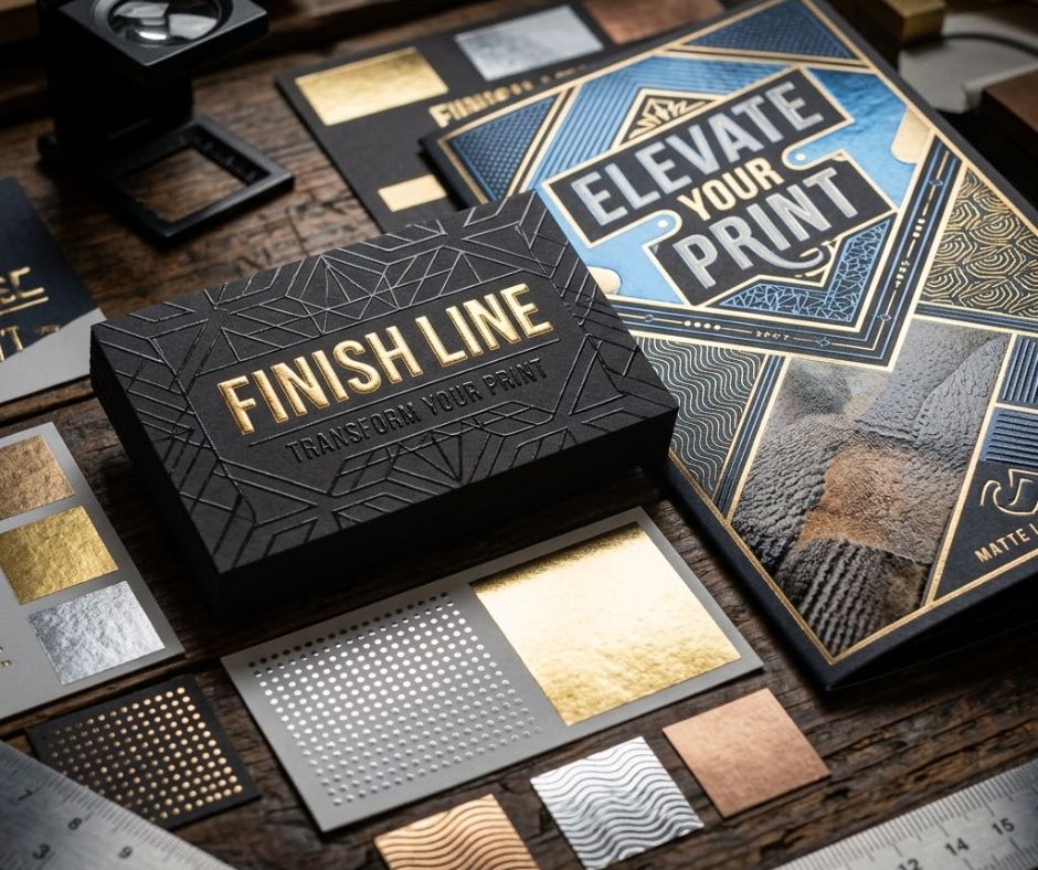
Foiling is where things get exciting. The process involves pressing a thin metallic foil onto the printed surface under heat, creating a brilliant reflective finish that catches the light beautifully.
Gold and silver foils are the classics, but the available range goes much further — copper, rose gold, holographic, even matt foils in unexpected colours. Foiling immediately signals luxury, occasion, and intent. It’s the finish you see on wedding invitations, premium business cards, high-end packaging, and award-winning brochures.
Used sparingly — on a logo, a key word, or a decorative element — foil draws the eye exactly where you want it. Used too liberally, it can tip into excess, so restraint is the secret. A small, beautifully placed foiled detail says more about a brand than a sheet covered in the stuff ever could.
Spot UV: The Subtle Showpiece
Spot UV is the most subtle of the three, and perhaps the most satisfying. It involves applying a high-gloss varnish to specific areas of a printed piece — typically over a matt-laminated background — creating a contrast between dull and shiny that you feel as much as see.
Run your finger across a spot UV business card and you can actually trace the raised, glossy areas. Hold it under a light and the difference between the matt and gloss elements creates a beautiful, almost three-dimensional effect.
Spot UV is brilliant for highlighting logos, key text, or decorative patterns. It rewards quiet attention rather than shouting for it, which makes it a particular favourite among brands that want to feel considered and confident without being flashy.
When to Invest in a Finish
The honest answer is whenever the piece matters. Business cards you’ll hand to important contacts. Brochures aimed at high-value clients. Wedding stationery. Anniversary mailers. Anything you want recipients to keep.
Finishes don’t dramatically increase costs, but they dramatically increase impact.
At Podds Print in Whyteleafe, we love helping clients choose the right finish for the right job. Bring us your project and we’ll show you samples, talk through the options, and help you find the perfect touch.
Get in touch today — let’s add some shine.