
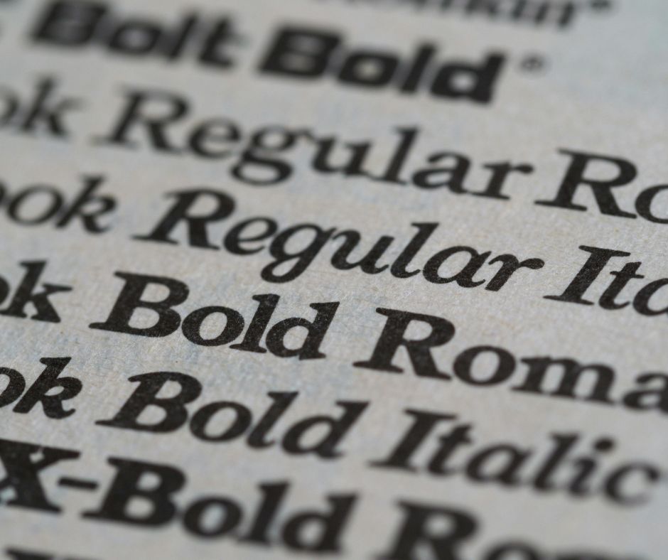
Choosing a font can feel overwhelming. You open a dropdown menu and a seemingly endless list appears. They have strange names like Garamond, Helvetica, and Comic Sans (we do not talk about Comic Sans). It is tempting to just pick one at random and hope for the best. But your choice of typeface does so much more than just display words. It sets the tone. It gives your text a voice. Getting typography right is a vital part of designing print that truly connects with your audience. Think of it as dressing your words for the occasion.
The Two Main Families: Serif vs. Sans-serif
Most typefaces fall into two large families. The distinction is simple. Serif fonts have tiny little “feet” or decorative strokes at the ends of their letters. Think of the classic font used in most books, Times New Roman. Those little feet guide the eye along the line, making long passages of text easy to read. Serifs feel traditional, respectable, and authoritative. They are the sensible shoes of the font world. Sans-serif fonts, as the name suggests, do not have these feet (‘sans’ is French for ‘without’). Fonts like Arial or Helvetica are clean, modern, and direct. They work wonderfully for headlines and short snippets of text. They feel approachable and clear. One is not better than the other. They just have different jobs to do.
Finding the Perfect Partner: Pairing Fonts
Using more than one font can create a pleasing visual contrast. But it is a delicate dance. Get it wrong, and your page looks like a chaotic jumble. The golden rule is to seek harmony through contrast, not conflict. A classic and safe approach is to pair a serif with a sans-serif. Use the sans-serif for your main headings and a serif for the body text, or vice-versa. This creates a clear hierarchy. It tells the reader what to look at first. Avoid pairing two fonts that are too similar. It looks like a mistake. And please, for the love of good design, limit yourself to two or three fonts maximum. Any more than that and you are hosting a typographic riot.
What Does Your Font Say About You?
Every font has a personality. A heavy, bold typeface might shout with confidence. A light, script font might whisper elegantly. The choice you make broadcasts a message about your brand. Are you a traditional, established law firm? A classic serif like Baskerville might suit you perfectly. Are you a fresh, modern tech startup? A clean sans-serif like Lato could be a great fit. This is not just about aesthetics. It is about building trust. The right font feels appropriate and reinforces your brand’s values. The wrong font can create a jarring disconnect for your customer. It is the visual equivalent of a bad handshake. So next time you choose a font, ask yourself: what do I want my words to say?