
Tom stared at the box of freshly delivered corporate brochures. On his computer screen, the deep navy and gold design looked absolutely magnificent. But holding the physical product in his hands, something felt completely wrong.
The paper was so highly reflective that the boardroom lights made the text impossible to read. Even worse? Every time he touched the cover, it left a visible smudge. “It looks cheap,” Tom sighed. “And we are definitely not a cheap business.”
This is the hidden trap of print marketing. You can spend weeks perfecting your graphic design, but if you choose the wrong paper finish, your message loses its punch.
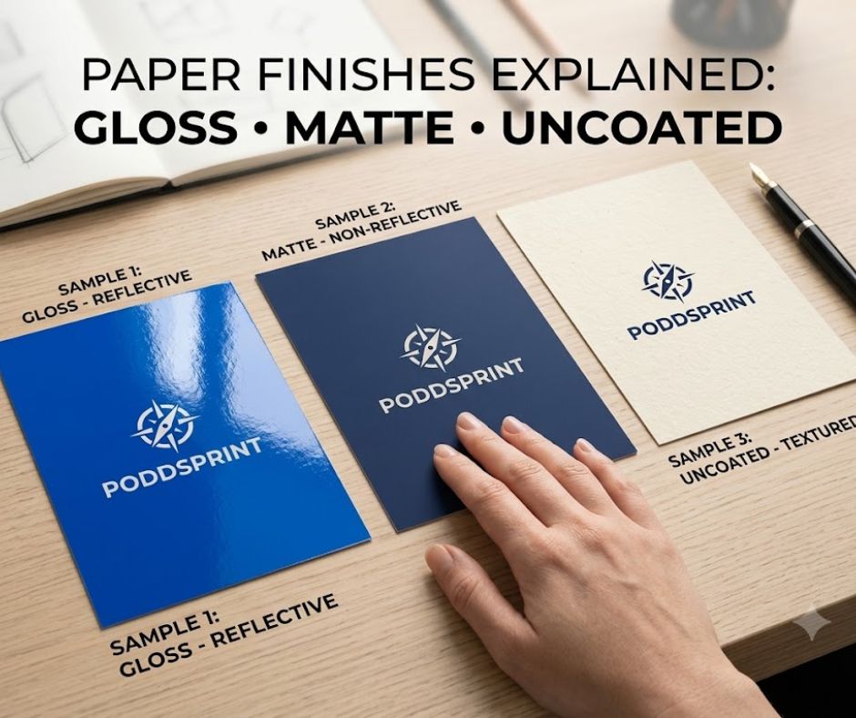
Paper isn’t just a carrier for ink—it is a tactile experience. The moment a prospective customer touches your print, their brain forms an instant opinion about your brand value. To help you avoid Tom’s marketing nightmare, let’s break down the three heavyweight champions of the paper world: Gloss, Matte, and Uncoated stock.
1. Gloss Stock: The High-Shine Attention Grabber
Gloss paper is coated with a polished layer that reflects light, giving it a smooth, shiny texture. If you want your colours to practically leap off the page, this is your go-to option.
Because the ink sits on top of the coating rather than sinking into the paper fibres, images appear incredibly sharp, crisp, and vibrant. It gives graphics a high-contrast, energetic feel that demands to be noticed.
- The Vibe: Vibrant, modern, high-energy, and commercial.
- Best Used For: * Promotional flyers and leaflets dropped through letterboxes.
- Takeaway menus that need food photography to look mouth-watering.
- Product catalogues with bright, vivid imagery.
- The Catch: Gloss reflects light heavily. Avoid it for items with giant walls of small text, as the glare can cause eye strain. It is also a magnet for fingerprints, so it might not suit items handled repeatedly.
2. Matte Stock: The Sophisticated Professional
Think of matte paper as the elegant, understated cousin of gloss. It still features a light coating, which keeps your images sharp and your colours rich, but it lacks the intense, reflective shine.
Instead, matte stock diffuses light. This creates a soft, velvety appearance that looks beautifully premium and executive. It strikes the perfect balance between visual clarity and effortless readability.
- The Vibe: Luxurious, professional, authoritative, and clean.
- Best Used For:
- High-end corporate brochures and annual reports.
- Art photography books or exhibition programmes.
- Premium presentation folders and information booklets.
- The Catch: While colours still look fantastic on matte paper, they won’t have that ultra-bright “pop” that gloss provides. If your marketing relies on neon or hyper-saturated tones, matte will soften them slightly.
3. Uncoated Stock: The Tactile Storyteller
Uncoated paper is exactly what it sounds like—paper in its purest form, without any added sealant or coating. Because there is no barrier, the paper fibres are completely exposed. When you run your thumb across it, you feel the natural texture of the paper itself.
When ink hits uncoated stock, it absorbs deep into the paper. This creates a warm, muted, and incredibly authentic look. It feels organic, deliberate, and deeply trustworthy.
- The Vibe: Premium, artisanal, classic, and honest.
- Best Used For:
- Official company letterheads, invoices, and formal stationery.
- Event invitations and high-end greeting cards.
- Notebooks, journals, or forms (because it is the only stock you can easily write on with a standard pen).
- The Catch: Because the paper acts like a sponge, images will lose a bit of their crisp sharpness. Deep blacks can look slightly charcoal, and bright colours will appear softer.
How to Make Your Final Decision
Choosing the right finish comes down to a simple question: What do you want your customer to do, and how do you want them to feel?
| If your primary goal is… | …choose this paper finish: |
| To showcase vibrant, colourful photography that stands out from afar. | Gloss Stock |
| To project a highly professional corporate image that is easy to read. | Matte Stock |
| To give a sense of heritage, craftsmanship, or allow people to write on it. | Uncoated Stock |
Before you hit “print” on your next big project, don’t leave the finish to guesswork. Think about the environment your print will live in. Will it be read under harsh office lights? Will it be stuffed into a pocket?
Matching the perfect paper finish to your brand’s personality is the ultimate secret weapon to turning casual readers into loyal, paying clients. Get the texture right, and the results will speak for themselves.